Cards
Cards are reusable content components that can be inserted into bulletins. They are useful for repeatable content such as crop information, pests or diseases, and recommendations.
Open Content → Cards to manage the Cards library.
1. Cards library
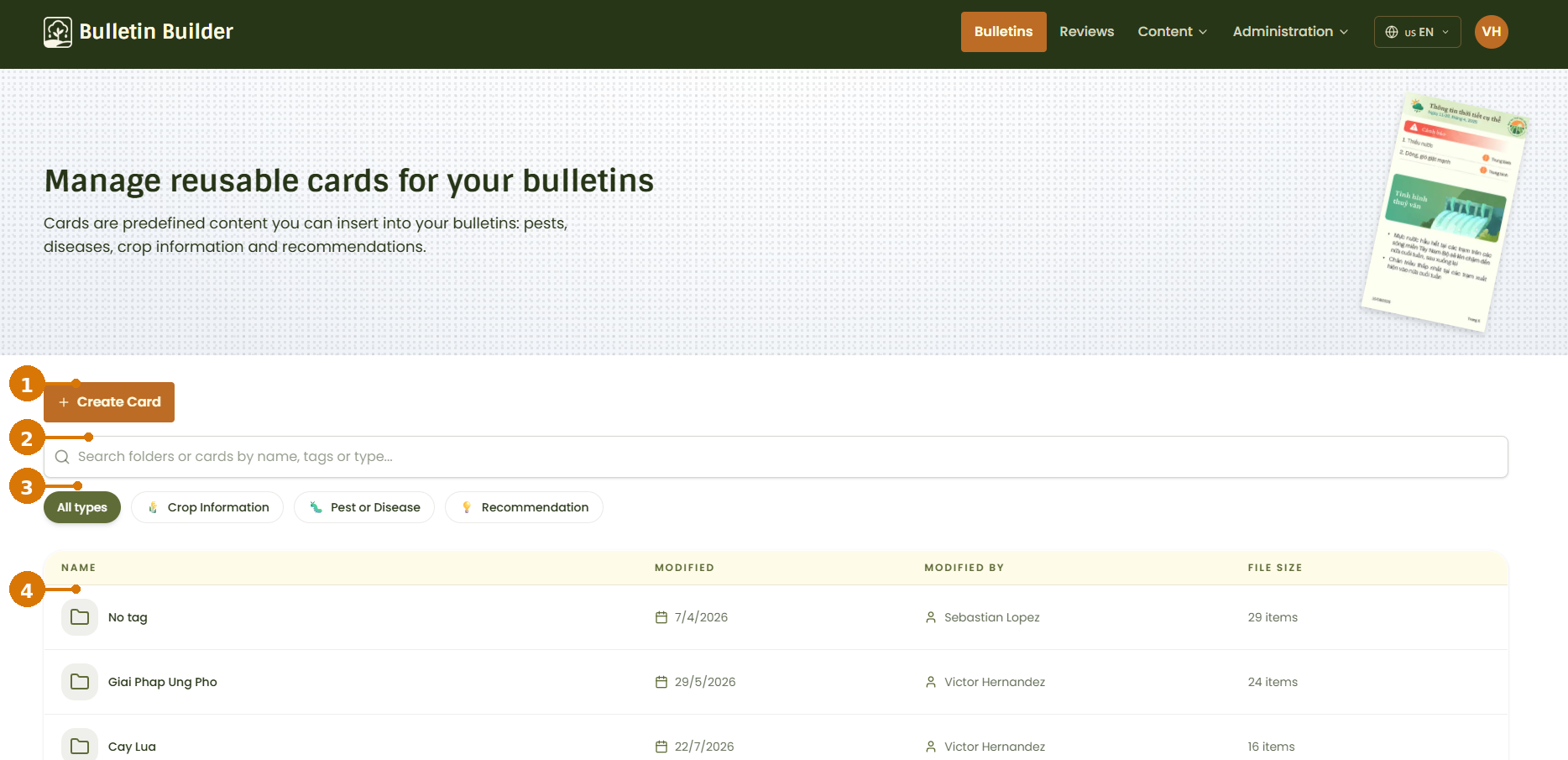
- Create Card — Opens the Card editor to create a new reusable Card.
- Search — Searches folders or Cards by name, tags, or type.
- Card type filters — Filters the library by Card type, such as Crop Information, Pest or Disease, or Recommendation.
- Folders and results — Cards are organized into folders based on their tags. The list also shows the last modification date, the user who modified the content, and the number of items in each folder.
A Card with multiple tags can appear in more than one tag folder. Cards without tags are grouped under No tag.
2. Create a Card
Click Create Card from the Cards library.
The Card editor opens with a blank Card and a single editable section.
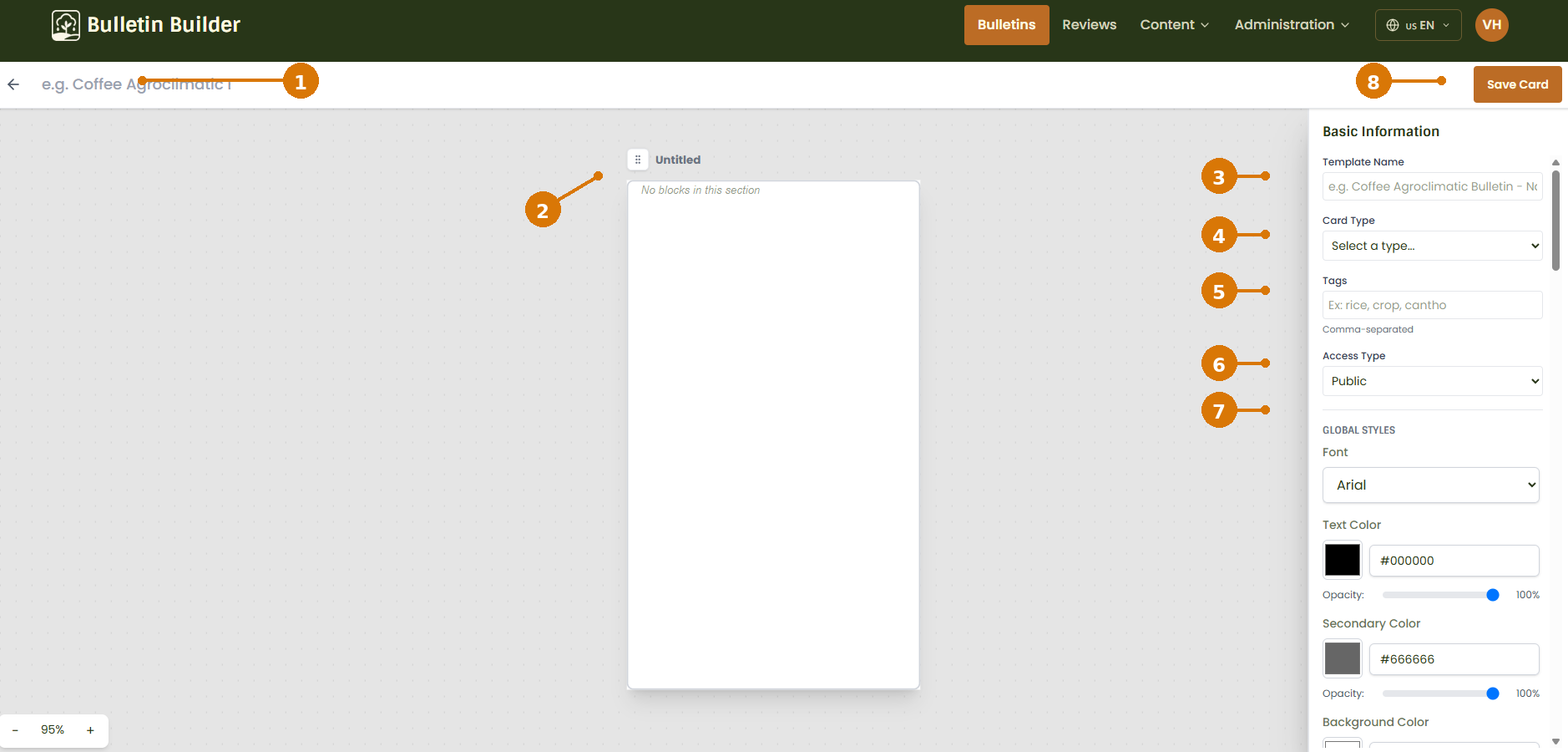
- Card name — Sets the name of the Card. The name is also displayed in the editor header.
- Card preview — Displays the current Card structure and provides a live preview while you build it.
- Template Name — Sets the Card name in the current editor.
- Card Type — Defines the Card category used for filtering and organization.
- Tags — Adds comma-separated tags used for search and folder organization.
- Access Type — Defines who can access the Card. See Access configuration.
- Global Styles — Defines the default visual appearance inherited by the Card content. See Style configuration.
- Save Card — Saves the Card after all required information and content have been configured.
Required information
A Card must have a name, a Card type, and at least one Block before it can be saved.
When Access Type is set to Restricted, select the groups that are allowed to use the Card. See Access configuration.
3. Configure the Card section
The Card editor reuses the same section-based editor used by Templates. For Cards, the editor works with a single section that contains the Card's Blocks and Fields.
Select the Card section in the preview to open its settings.
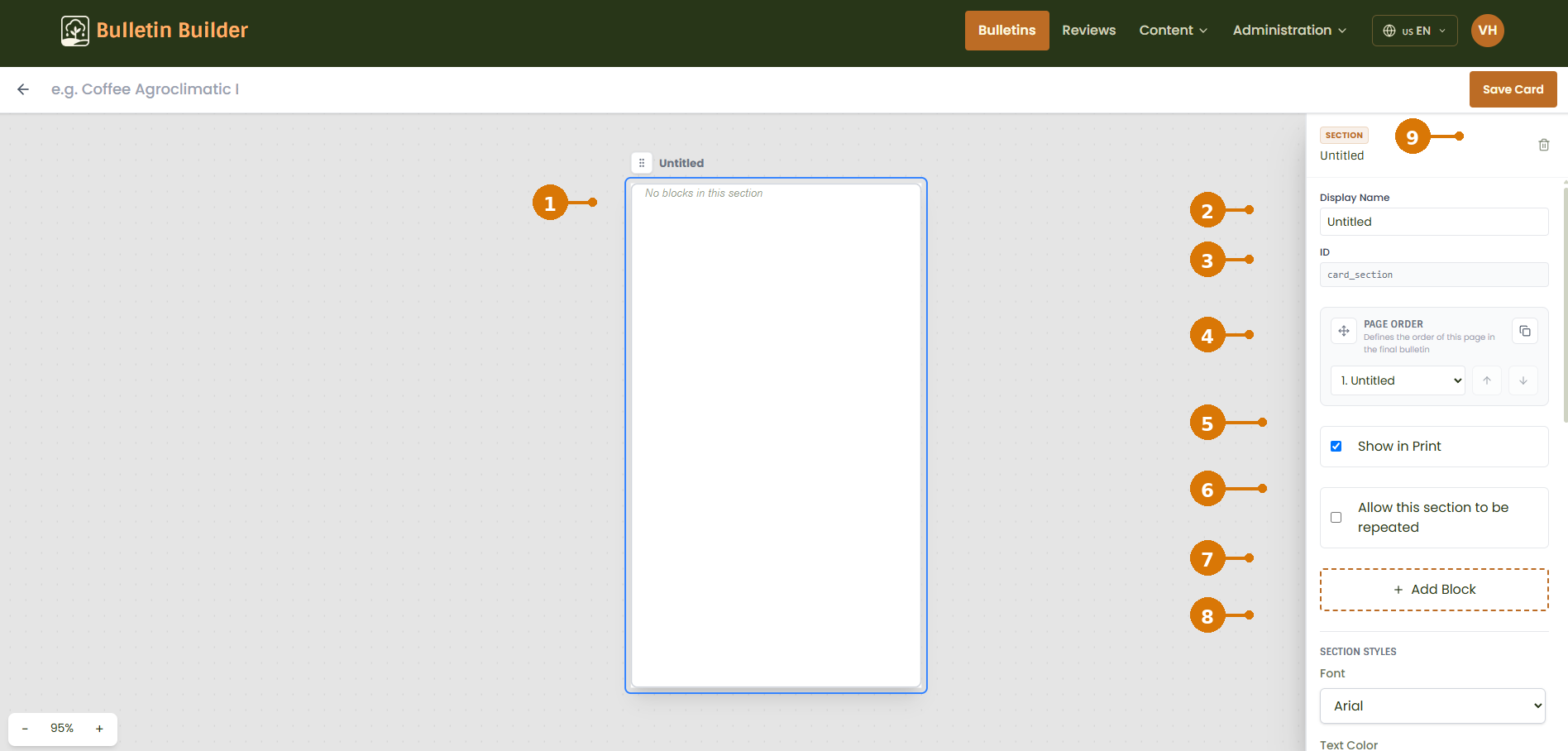
- Selected section — The blue outline identifies the section currently being edited.
- Display Name — Changes the display name shown for the section in the editor.
- ID — Displays the section identifier used internally by the editor.
- Page Order — Controls the position of the section in the editor.
- Show in Print — Controls whether the section is included in printable output.
- Allow this section to be repeated — Enables the repeatable-section option exposed by the editor.
- Add Block — Adds a new Block to the Card.
- Section Styles — Configures visual properties such as font, colors, background, spacing, and other shared style options.
- Delete section — Removes the selected section from the editor.
Cards use a single section
Cards are stored differently from Templates. The editor represents a Card as a single section, but the saved Card JSON does not contain a sections array. The Card's Blocks are stored directly in content.blocks, while section-level visual properties are mapped to the Card's content and style configuration.
For the reusable styling properties, see Style configuration.
4. Add and configure a Block
Click Add Block from the section settings.
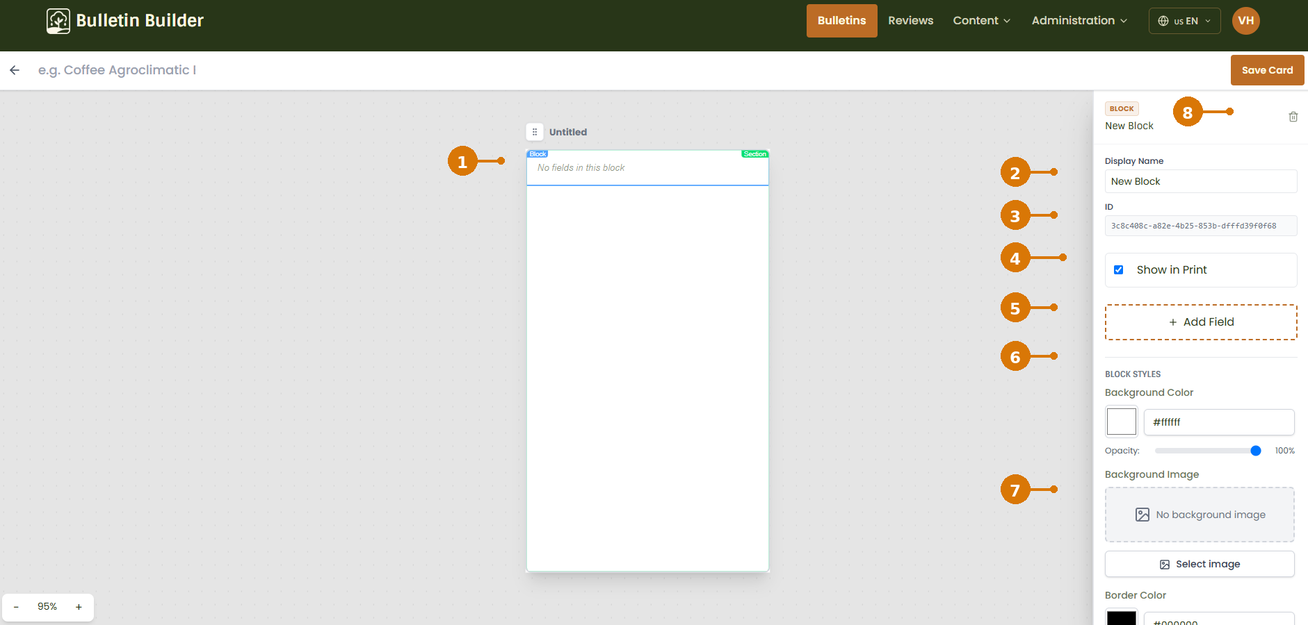
- Selected Block — The highlighted area identifies the Block currently being edited.
- Display Name — Sets the name used to identify the Block in the editor.
- ID — Displays the Block identifier.
- Show in Print — Controls whether the Block appears in printable output.
- Add Field — Adds a new Field inside the selected Block.
- Block Styles — Configures the Block's visual appearance using the shared
style_configproperties. - Background Image — Adds or changes the Block background image. Use Select image to choose an available visual resource.
- Delete Block — Removes the selected Block from the Card.
Block styling follows the shared Style configuration.
For images that should be reused as backgrounds, see Visual Resources.
5. Add and configure a Field
Click Add Field from the Block settings.
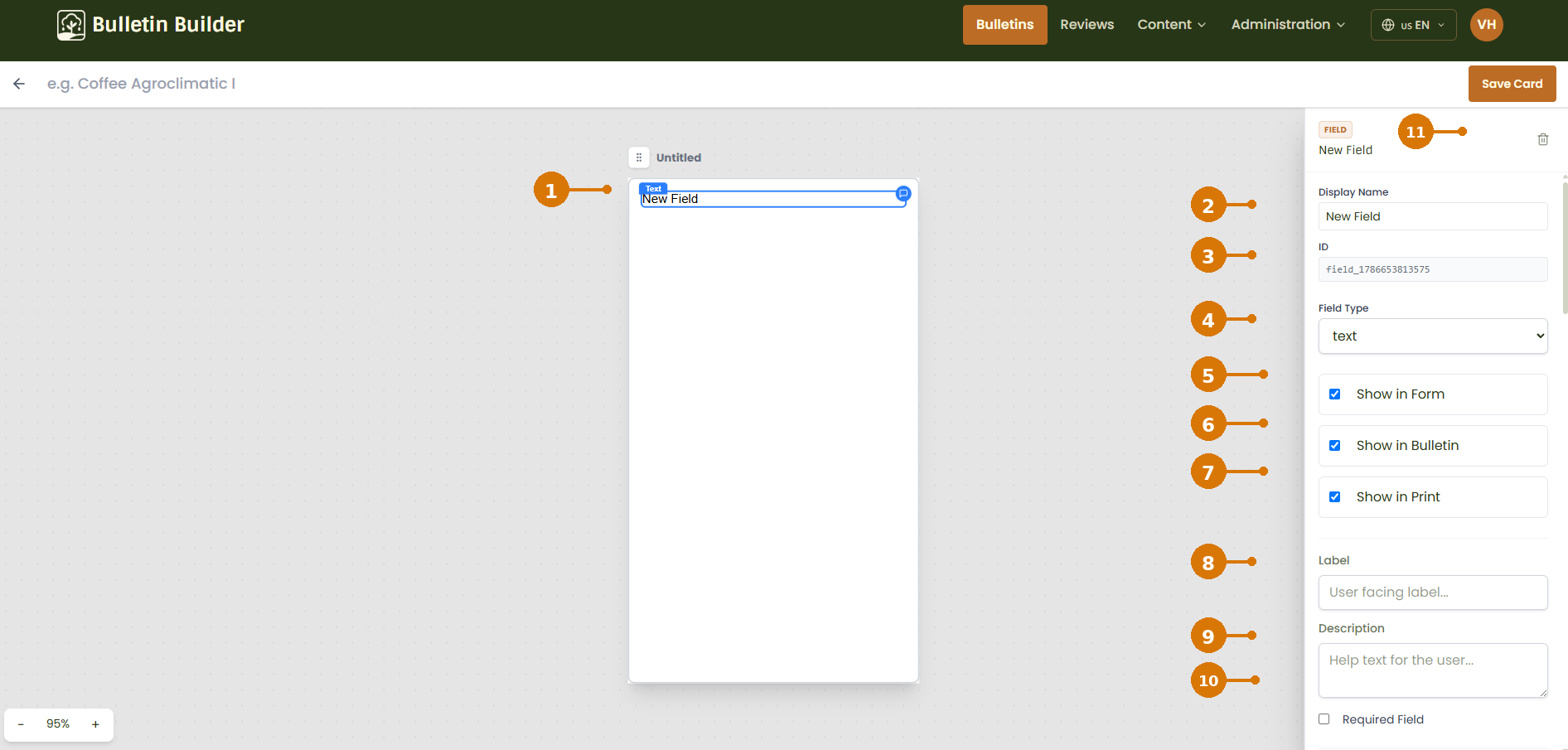
- Selected Field — The highlighted element identifies the Field currently being edited.
- Display Name — Sets the internal display name used in the editor.
- ID — Displays the Field identifier.
- Field Type — Defines the behavior of the Field. See Field types.
- Show in Form — Makes the Field available when users fill in content.
- Show in Bulletin — Includes the Field in the generated Bulletin content.
- Show in Print — Includes the Field in printable output.
- Label — Defines the user-facing label.
- Description — Adds help text or additional information for the user.
- Required Field — Makes the Field mandatory when applicable.
- Delete Field — Removes the selected Field.
Different Field Types expose different configuration options. See Field types for the shared explanation of each type.
6. Configure Field validation and styles
Scroll down in the Field settings to configure validation and visual properties.
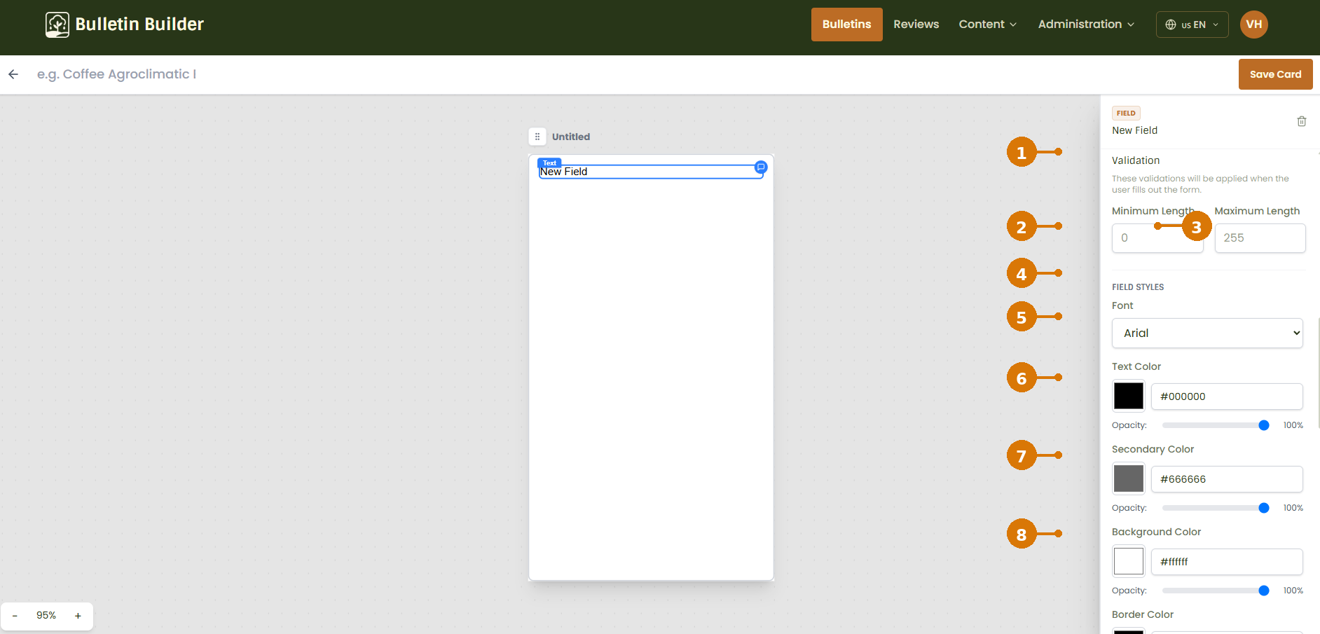
- Validation — Contains the validation rules available for the selected Field Type.
- Minimum Length — Defines the minimum accepted length for a text value.
- Maximum Length — Defines the maximum accepted length for a text value.
- Field Styles — Contains visual configuration specific to the Field.
- Font — Sets the Field font.
- Text Color — Sets the primary text color and opacity.
- Secondary Color — Sets the secondary color and opacity.
- Background Color — Sets the Field background color and opacity.
The available validation rules depend on the selected Field Type. See Validation rules.
Field styles use the shared style_config structure. Field-level styles can override values inherited from the Card's global or Block styles.
7. Save the Card
Before saving, verify that:
- the Card has a name;
- a Card Type has been selected;
- restricted Cards have the appropriate Allowed Groups;
- the Card contains at least one Block;
- the Fields have the required labels, validations, and visibility settings.
Click Save Card in the upper-right corner.
The application saves the Card and generates or updates its preview thumbnail.
8. Edit a Card
Open an existing Card from the Cards library to edit it.
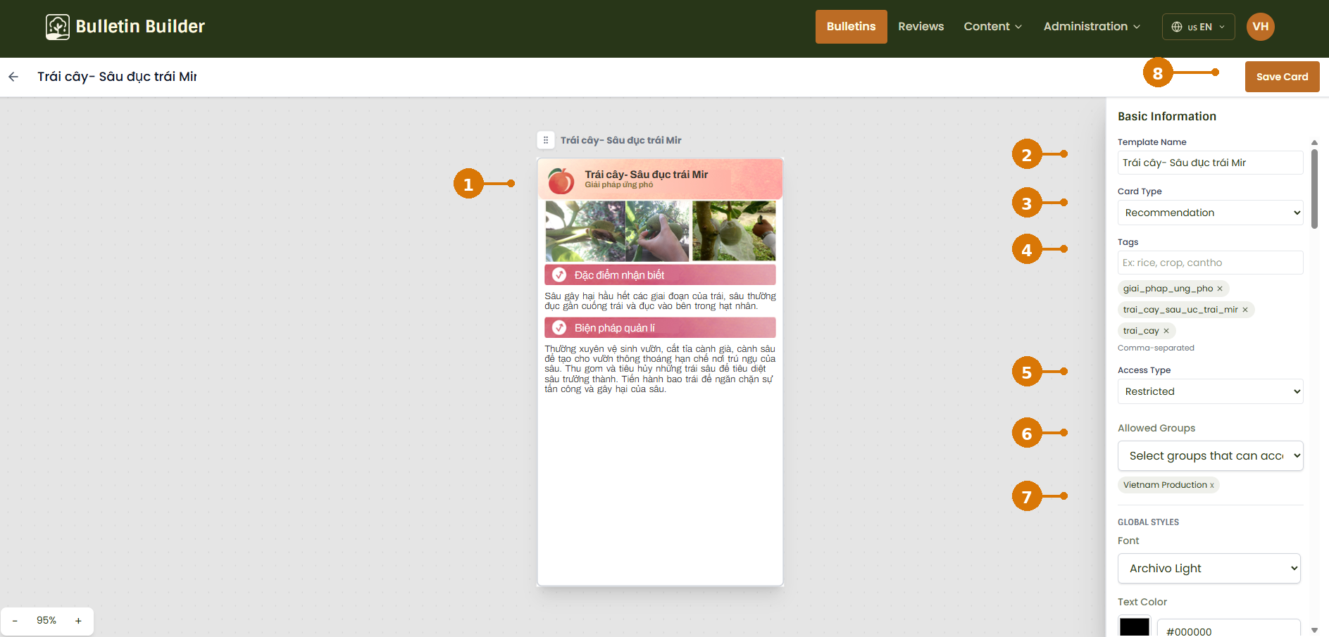
- Card preview — Shows the existing Card and reflects changes made in the editor.
- Template Name — Updates the Card name in the current Card editor.
- Card Type — Changes the Card category.
- Tags — Adds or removes tags used for search and folder organization.
- Access Type — Changes the Card access level.
- Allowed Groups — Appears when the Card uses restricted access and defines which groups can access it.
- Global Styles — Updates the Card's default visual styles.
- Save Card — Saves the changes.
You can also select the Section, Blocks, or Fields in the preview to update their content, visibility, validation, and style settings.
See Access configuration and Style configuration for shared settings.
9. Duplicate a Card
Duplicating a Card creates a new Card from an existing one without modifying the original.
Choose the Duplicate action for the Card.
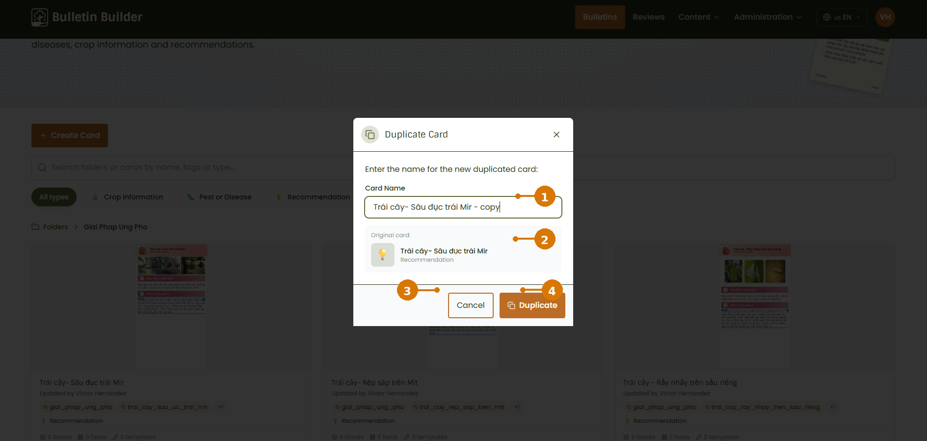
- Card Name — Enter the name for the duplicated Card. The application proposes a name ending in
- copy. - Original card — Identifies the Card that will be used as the source.
- Cancel — Closes the dialog without creating a copy.
- Duplicate — Creates the new Card.
After duplication, open the new Card and modify its content as needed.
10. Delete a Card
Choose the Delete action from the Card's available actions.
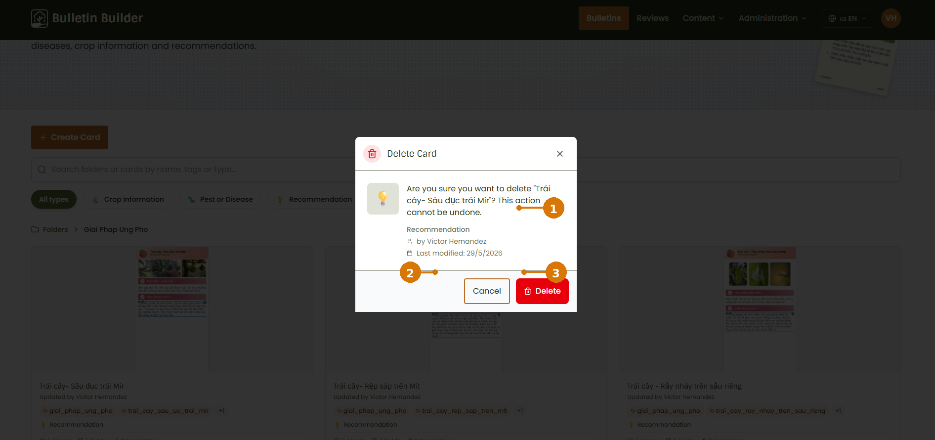
- Card information — Review the Card name, type, author, and last modification date before confirming the action.
- Cancel — Closes the dialog without changing the Card.
- Delete — Confirms the action.
Delete behavior in the current build
The interface presents this action as Delete and warns that it cannot be undone. In the current frontend implementation, confirming the action changes the Card status to archived, which removes it from the active Cards list rather than performing a database hard-delete.
11. How the Card JSON is built
Users normally create and edit Cards through the interface. The JSON representation is useful for administrators, integrators, and support users who need to understand how the interface stores the configuration.
The main UI-to-JSON relationships are:
| Interface setting | JSON property |
|---|---|
| Card name / Template Name | card_name |
| Tags | tags |
| Card Type | card_type |
| Access Type and Allowed Groups | access_config |
| Global Styles | content.style_config |
| Card background | content.background_url, content.background_color, content.background_opacity |
| Blocks | content.blocks[] |
| Block styles | content.blocks[].style_config |
| Fields | content.blocks[].fields[] |
| Field Type | content.blocks[].fields[].type |
| Show in Form | form |
| Show in Bulletin | bulletin |
| Show in Print | print |
| Field validation | validation |
| Field-specific options | field_config |
| Field styles | style_config |
| Active / archived state | status |
Single-section editor vs. Card JSON
The Card editor creates a single editor section with the internal ID card_section. This section exists so the Card can use the shared visual editor. When the Card is saved, its Blocks are stored directly in content.blocks; there is no content.sections array in the Card JSON.
The application also maintains system-managed information such as _id, thumbnail_images, and log.
Example Card JSON
{
  "_id": "card-coffee-pest-alert",
  "card_name": "Coffee Pest Alert",
  "tags": [
    "coffee",
    "pest",
    "monitoring"
  ],
  "card_type": "pest_or_disease",
  "thumbnail_images": [
    "/assets/thumbnails/card-coffee-pest-alert/preview.png"
  ],
  "templates_master_ids": [
    "template-coffee-monthly"
  ],
  "access_config": {
    "access_type": "restricted",
    "allowed_groups": [
      "group-colombia-editors"
    ]
  },
  "content": {
    "background_url": "/assets/img/visualResources/restricted/pest-background.jpg",
    "background_color": "#fefae0",
    "background_opacity": 0.18,
    "style_config": {
      "font": "Arial",
      "primary_color": "#000000",
      "secondary_color": "#666666",
      "background_color": "#ffffff",
      "padding": "20px",
      "gap": "12px"
    },
    "blocks": [
      {
        "block_id": "pest_information",
        "display_name": "Pest information",
        "print": true,
        "style_config": {
          "padding": "12px",
          "gap": "8px",
          "background_color": "#ffffff"
        },
        "fields": [
          {
            "field_id": "recommendation_text",
            "display_name": "Recommendation",
            "type": "text",
            "label": "Recommendation",
            "description": "Recommended action for the user",
            "form": true,
            "bulletin": true,
            "print": true,
            "validation": {
              "required": true,
              "min_length": 0,
              "max_length": 255
            },
            "style_config": {
              "font": "Arial",
              "primary_color": "#000000",
              "secondary_color": "#666666",
              "background_color": "#ffffff"
            },
            "field_config": {
              "subtype": "short"
            }
          }
        ]
      }
    ]
  },
  "status": "active",
  "log": {
    "created_at": "2026-08-12T09:00:00-05:00",
    "creator_user_id": "user-102",
    "creator_first_name": "Ana",
    "creator_last_name": "Gomez"
  }
}