Templates
Templates define the reusable structure of a Bulletin. They control the bulletin dimensions, global styles, headers and footers, sections, blocks, and fields that users will later fill in.
Open Content → Templates to manage the Templates library.
1. Templates library
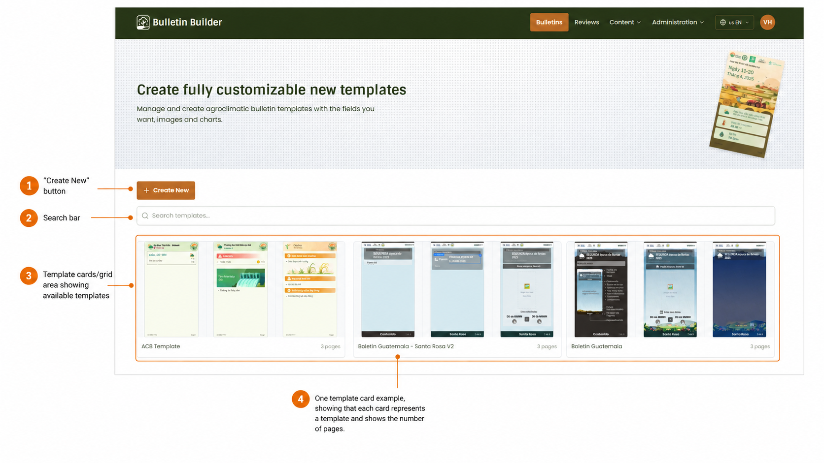
- Create New — Opens the Template editor to create a new Template.
- Search bar — Searches templates by name.
- Template cards / grid — Displays the available templates in the library.
- Template card example — Each card represents one template and shows a preview plus the number of pages.
From the template card actions, users can preview, edit, duplicate, or archive a template.
2. Create a Template — Basic Information
Click Create New from the Templates library.
The editor opens with a blank template canvas and the configuration panel on the right.
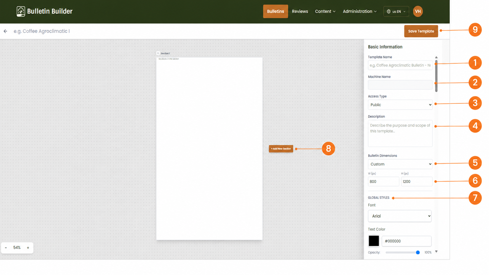
- Template Name — Sets the name of the template.
- Machine Name — Shows the internal identifier used by the system.
- Access Type — Defines whether the template is public or restricted. See Access configuration.
- Description — Describes the purpose or intended use of the template.
- Bulletin Dimensions — Chooses the page size mode.
- Width and Height — Defines the bulletin size in pixels.
- Global Styles — Sets the default appearance inherited by the template content. See Style configuration.
- Add New Section — Adds a new top-level section to the template.
- Save Template — Saves the template.
Required information
Before saving, define at least the Template Name and create the necessary structural content (sections, blocks, and fields).
If Access Type is Restricted, the interface will also show Allowed Groups.
3. Header and Footer configuration
Scroll in the right-side panel to the Header and Footer Configuration area.
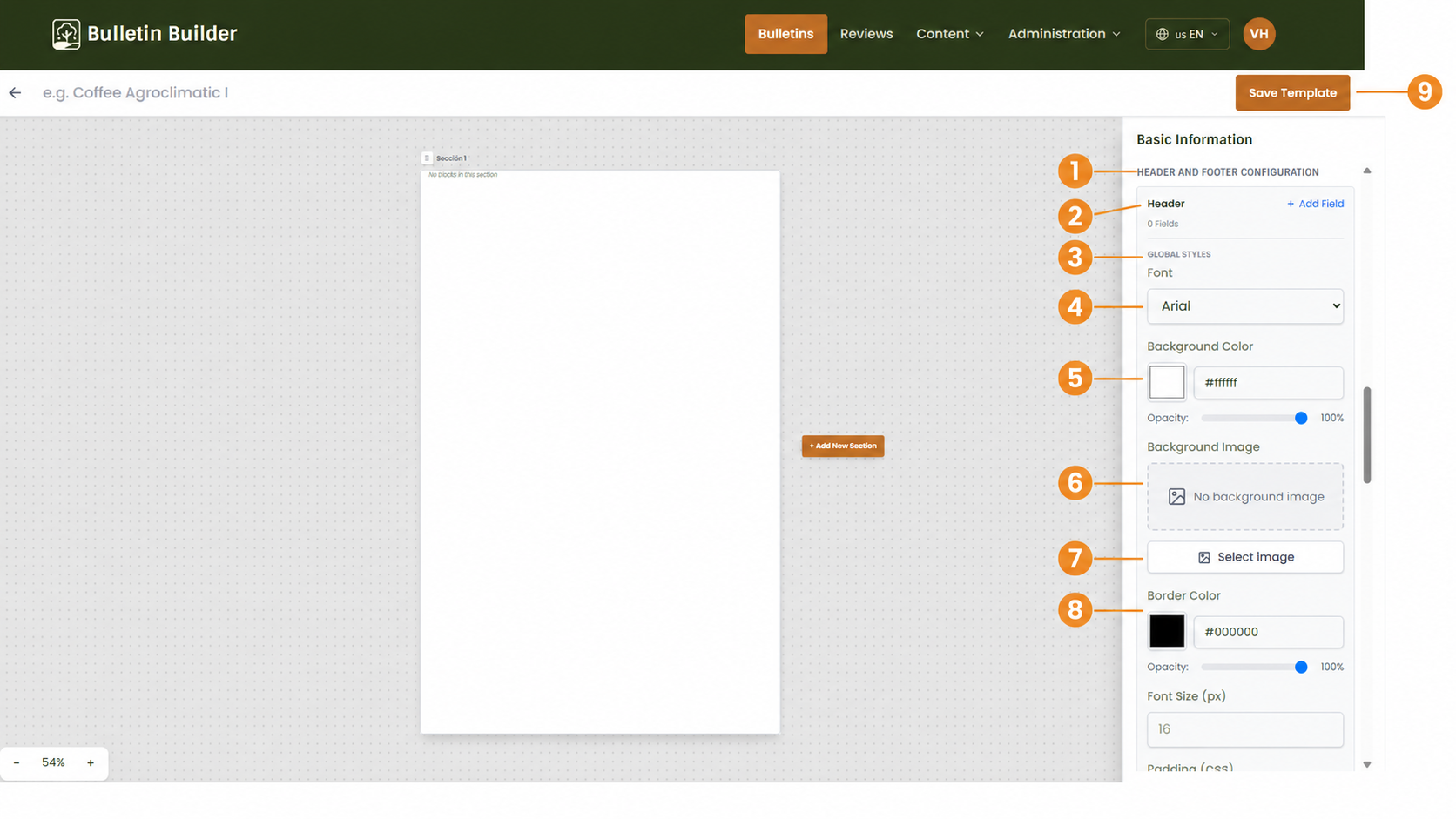
- Header and Footer Configuration — Identifies the area where the global header and footer are configured.
- Header / Add Field — Adds fields that should appear in the global header.
- Global Styles — Opens the style controls for the current header or footer area.
- Font — Sets the default font.
- Background Color — Configures the background color and opacity.
- Background Image — Shows the selected image area or indicates that none is selected.
- Select image — Opens the visual resource selector for a background image.
- Border Color — Configures the border color and opacity.
- Save Template — Saves the current configuration.
The same logic applies to the Footer configuration when you scroll further down the panel.
4. Configure section settings
Select a section on the canvas to edit its properties.
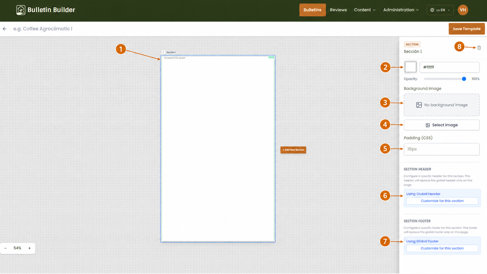
- Selected section — The highlighted page on the canvas is the section currently being edited.
- Background Color — Sets the section background color.
- Background Image — Shows the current background image area.
- Select image — Assigns or changes the section background image.
- Padding — Defines the internal spacing of the section.
- Section Header — Lets you keep the global header or customize the header only for this section.
- Section Footer — Lets you keep the global footer or customize the footer only for this section.
- Delete section — Removes the selected section.
Section-level styles override the global configuration for that specific section.
5. Add and configure a Block
Inside a section, add a Block and then select it to edit its properties.
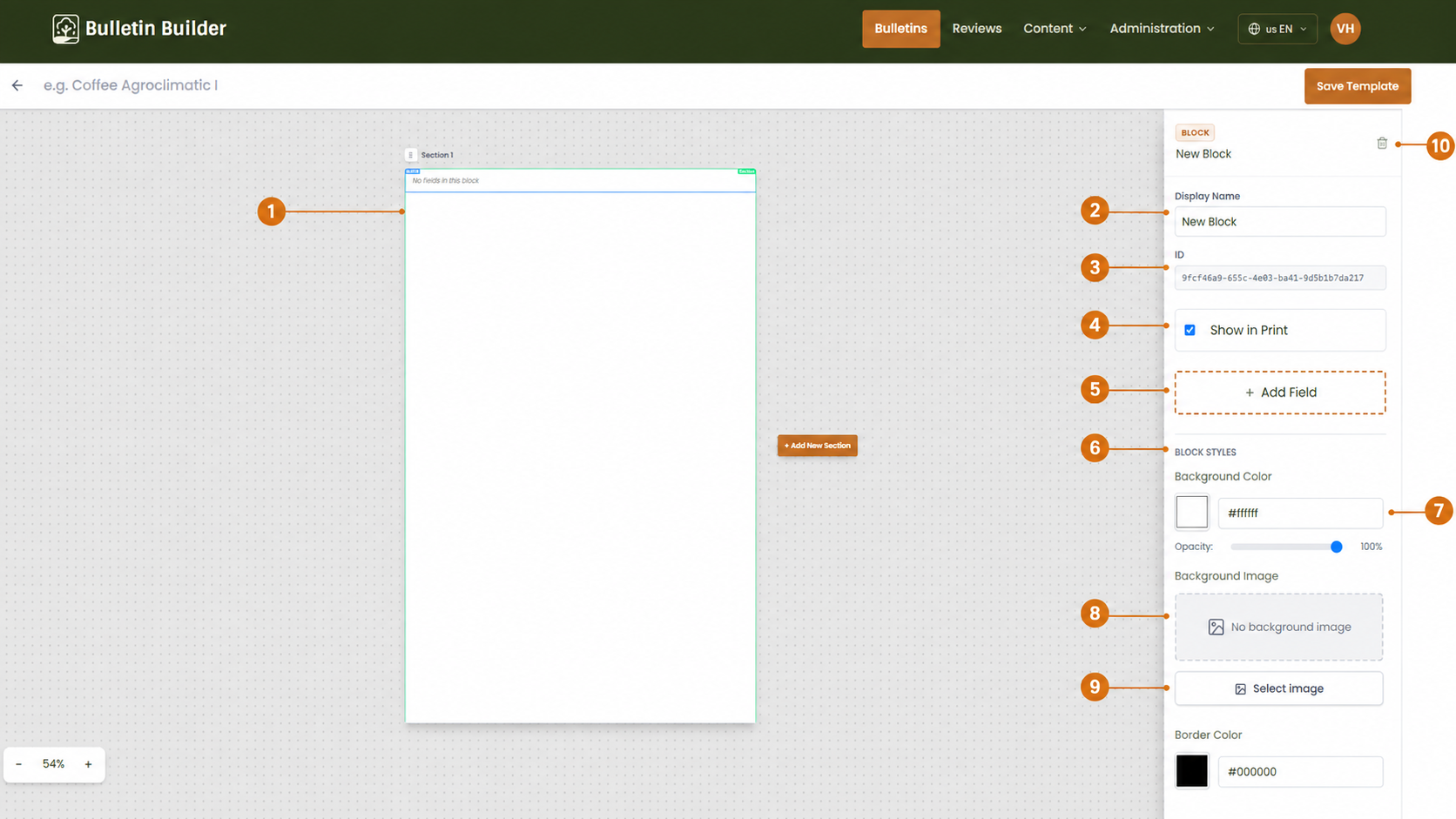
- Selected Block — The highlighted area identifies the block currently being edited.
- Display Name — Sets the block name shown in the editor.
- ID — Shows the internal block identifier.
- Show in Print — Controls whether the block appears in printable output.
- Add Field — Adds a new field inside the block.
- Block Styles — Groups the visual settings for the block.
- Background Color — Sets the block background color and opacity.
- Background Image — Shows the current background image state.
- Select image — Assigns or changes the block background image.
- Delete Block — Removes the selected block.
Blocks are the main containers that hold fields inside each section.
6. Add and configure a Field
Click Add Field from the block settings and select the new field.
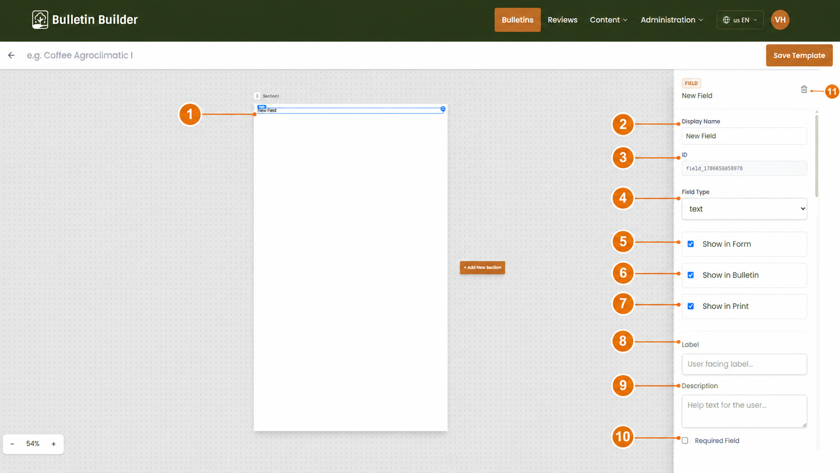
- Selected Field — The highlighted element identifies the field currently being edited.
- Display Name — Sets the internal field name.
- ID — Shows the internal field identifier.
- Field Type — Defines the behavior of the field. See Field types.
- Show in Form — Makes the field available when users fill in the bulletin.
- Show in Bulletin — Includes the field in the bulletin content.
- Show in Print — Includes the field in printable output.
- Label — Defines the user-facing field label.
- Description — Adds helper text for users.
- Required Field — Makes the field mandatory when applicable.
- Delete Field — Removes the selected field.
Different field types expose different configuration and validation options. See Field types and Validation rules.
7. Configure section behavior and page order
Templates can contain multiple sections. Select a section to configure how it behaves.
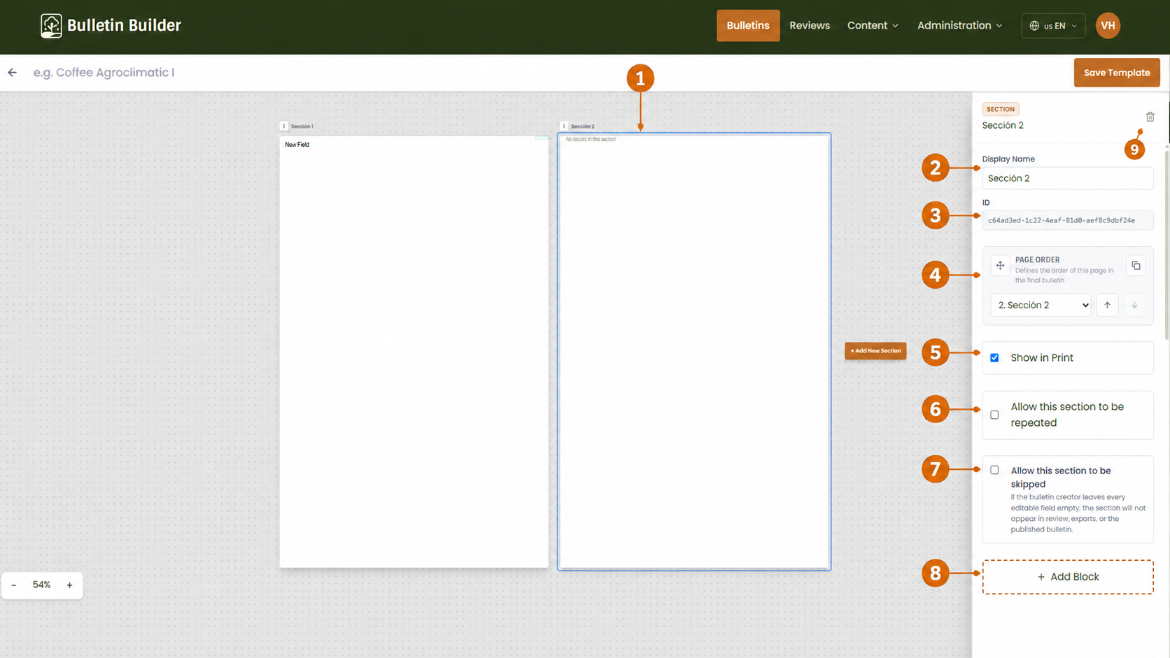
- Selected section — The blue outline identifies the section currently being edited.
- Display Name — Changes the section name.
- ID — Shows the section identifier.
- Page Order — Controls the order of the section in the final bulletin.
- Show in Print — Controls whether the section appears in printable output.
- Allow this section to be repeated — Lets bulletin creators duplicate the section in bulletin instances.
- Allow this section to be skipped — Lets the system omit the section if the content is left empty.
- Add Block — Adds a new block inside the section.
- Delete section — Removes the selected section.
Use these settings when a template needs optional pages or repeatable content structures.
8. Preview a Template
Use the preview action from the Templates library to review the generated template pages.
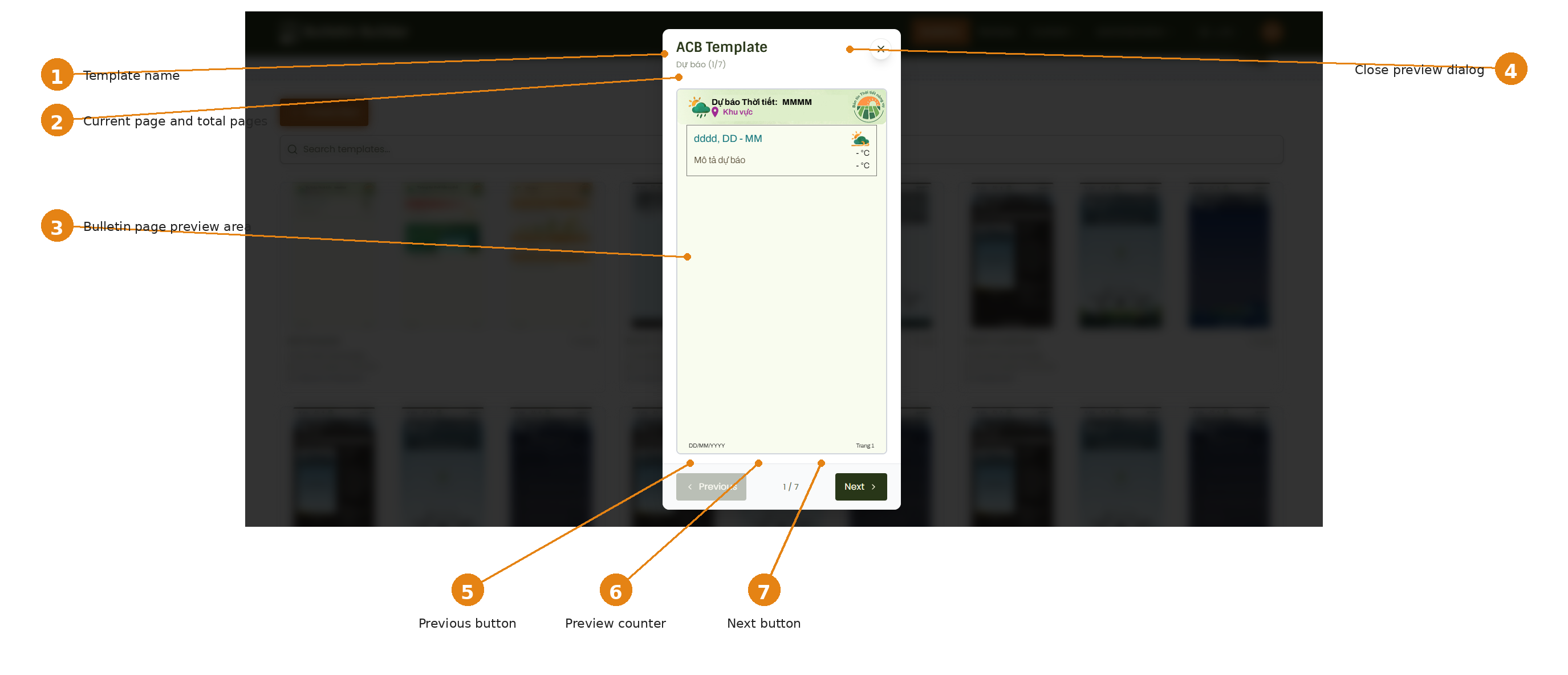
- Template name — Displays the name of the template being previewed.
- Current page indicator — Shows the current page and the total number of pages.
- Bulletin page preview — Shows the rendered page preview.
- Close preview dialog — Closes the preview window.
- Previous — Moves to the previous page.
- Preview counter — Shows the current page position in the preview controls.
- Next — Moves to the next page.
Preview is useful for checking the structure and visual layout before editing or publishing changes.
9. Edit an existing Template
Open an existing template from the library to modify it.
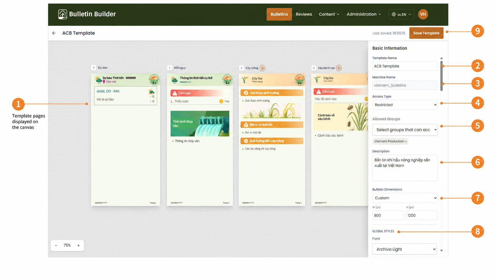
- Template pages on the canvas — Shows the pages already defined in the template.
- Template Name — Updates the template name.
- Machine Name — Shows the internal identifier.
- Access Type — Updates the access level.
- Allowed Groups — Defines which groups can use the template when access is restricted.
- Description — Updates the template description.
- Bulletin Dimensions — Shows and updates the page size configuration.
- Global Styles — Updates the default styles for the template.
- Save Template — Saves the changes.
You can also select sections, blocks, and fields directly on the canvas to modify their configuration.
Editing updates the template configuration
Review all inherited sections, blocks, fields, styles, and access settings before saving changes.
10. Duplicate a Template
Use Duplicate when you want to create a new template based on an existing one.
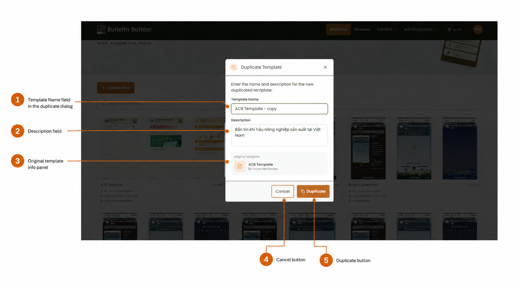
- Template Name — Sets the name of the new duplicated template.
- Description — Sets or updates the description for the duplicate.
- Original template info panel — Identifies the source template being copied.
- Cancel — Closes the dialog without creating a duplicate.
- Duplicate — Creates the new template.
After duplication, open the new template and review its structure, styles, and access settings.
11. Archive a Template
Use Archive to remove a template from the active list without permanently deleting it.
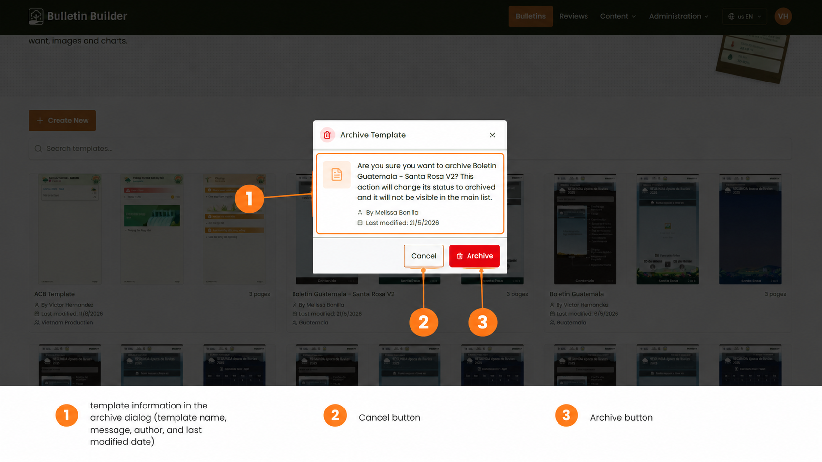
- Template information — Shows the template name, warning message, author, and last modified date.
- Cancel — Closes the dialog without changing the template status.
- Archive — Confirms the archive action.
Archived templates no longer appear in the main active library list.
12. How the Template JSON is built
The template interface stores configuration across a reusable structure made of sections, blocks, and fields.
The main UI-to-JSON relationships are:
| Interface setting | JSON property |
|---|---|
| Template Name | template_name |
| Machine Name | machine_name |
| Access Type and Allowed Groups | access_config |
| Description | description |
| Bulletin Dimensions | content.style_config.width, content.style_config.height |
| Global Styles | content.style_config |
| Header configuration | content.header_config |
| Footer configuration | content.footer_config |
| Sections | content.sections[] |
| Section styles | content.sections[].style_config |
| Blocks | content.sections[].blocks[] |
| Block styles | content.sections[].blocks[].style_config |
| Fields | content.sections[].blocks[].fields[] |
| Field type | content.sections[].blocks[].fields[].type |
| Field visibility | form, bulletin, print |
| Field validation | validation |
| Field-specific options | field_config |
| Template status | status |
The general content hierarchy is:
style_config
header_config
sections[]
  └─ blocks[]
      └─ fields[]
footer_config
For reusable style properties, see Style configuration. For field-specific rules, see Field types and Validation rules.